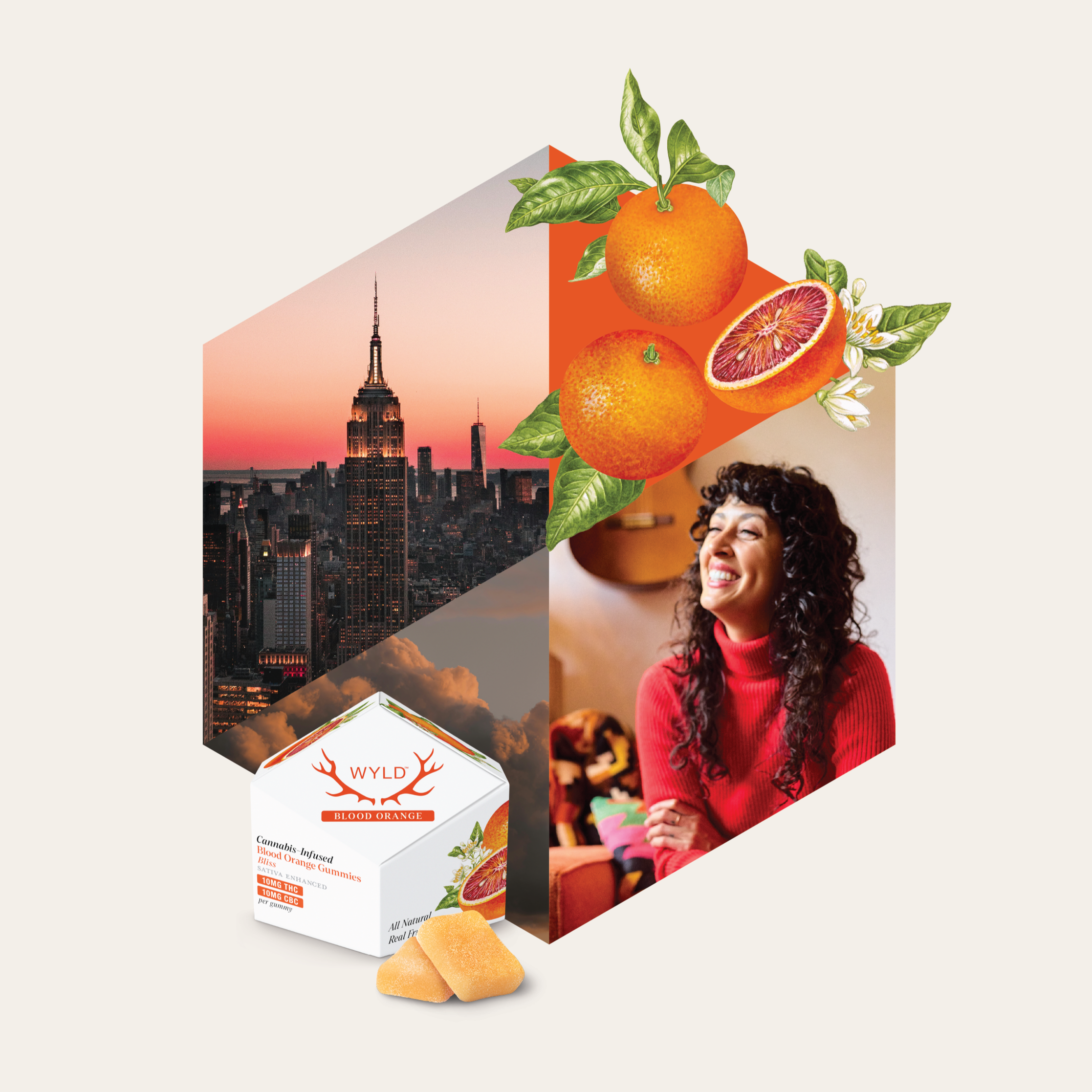
What could be a more corny holiday than Valentine's Day? For this project, I wrote food puns and chose my favorites to illustrate a colorful, eye-catching pop-up card that would be appropriate for friends and significant others alike.
Both the rolls on the cover and back as well as the inner soy sauce bottles were my own illustrations.
In this project, I designed the album cover artwork for the local Denver rock band Fox Moses’ new EP, “FM Hall.” FM Hall is an older building in the RiNo district of Denver directly across from the band’s rehearsal space, so I wanted to portray the building in a moody, grungy sort of light for the artwork.
Parker Arts was in need of a designer for their 5-year cultural plan under a very tight deadline. I was able to brand and design the entire document within 3 days, theming the booklet based on the architecture of the building and variations of the organization’s logos.
While working for TTEC, a global company that transforms customer experiences, I had the opportunity to design materials for site visits. On these visits, TTEC would outfit a call center with branding to fit the prospective client. For this visit, I designed posters, T-shirts, screensavers and a booklet to guide the meeting for the Australian telecommunications company Optus.
For this project, I designed my own food magazine based on the premise of a higher-end publication, produced less frequently, with far fewer ads than typical newsstand magazines. I also designed a tablet edition, considering how readers would best interact with the pages on a digital platform. All of the photography, apart from the ads, is my own.
Juniper Distilling consists of a line of gins, tonics, syrups and bitters. For the packaging, I wanted to create an elegant design with an element of subtle botanic whimsy, which can be seen through the bottle.
The Leaf application serves as an app for all things tea. The user can utilize the app as a tea timer, to determine what sort of tea best suits their mood, and to set up recurring orders of the tea of their choosing.
The web edition would provide even more in-depth information on teas and a wider variety of browsing and account management.
The White Plague is a science fiction novel about a plague that wipes out most of the women on the planet and how that plague came to fruition. The original cover (pictured at the bottom), read as more of a fantasy story — more Tolkien than dystopian future. I wanted to approach the cover in a scientific way and included an inverted cover beneath the dust jacket to symbolize the darkness behind the name of the plague. For this project I shot my own photography for the cover art.
For this logo, I wanted to pay homage to my Arizona roots, and develop a desert-themed brewery. The misconception is that there's not wildflowers or an abundance of life in the desert, and I wanted to challenge that with my logo design.
While freelancing for TTEC, I was tasked with designing the first section of the company culture book. They wanted a playful sort of design to pull in new and potential employees, so the team and I collaborated on ideas. I developed the character/paragraph styles and layouts and built out the first section before the rest of the project went to the internal design team.
This piece was a Photoshop extravaganza! RE Construction was hosting its annual holiday party with an enchanted forrest theme, so I used multiple elements to create a fairy, twinkle lights, glowing flower, night scene etc. to their exact specifications for a printed invitation as well as an emailed save the date.
In October of 2017, I served as the designer for Rocky Mountain Collegian's Best of CSU publication. The magazine serves as the main fundraiser for student media, as a survey is sent to students to determine the best restaurants and stores in Fort Collins, and the winning shops pay to advertise. The free publication was placed around campus and downtown Fort Collins.
I was able to develop the year's Best of CSU seal, choose the colors, fonts and branding as well as execute all of the layout design aside from advertisements. Fellow student Melissa Leavenworth served as the writer and editor, and our photographers were Wisdom Senolos and Nathan Daine. View the full publication here.
In addition, College Media Business & Advertising Managers awarded the publication First Place for Best Special Section.
This project was conceived in a group — we wanted a social media app revolving around food, but that was more user-friendly than Yelp. With this app, you connect with friends and see their latest food reviews in your feed. Users would log the average amount each person spent, leave comments and photos, and answer questions about wait times. While this sounds like a lot of information, the questions would prompt simple responses from users for quick but thorough reviews. Users could also create events and make group reservations together.
During my time with CSU External Relations, I was tasked with finding a better way to present the accomplishments of the varying faculty councils on campus. I made the report more visually focused, and it was used to present the successes and progress of these councils across campus.
This illustration pays tribute to the late influential oceanographer Jacques Cousteau. I really wanted to capture his time in the sun, as well as his characteristic accessories — the bright orange-red beanie, his pipe and his classic blue chambray shirt.